

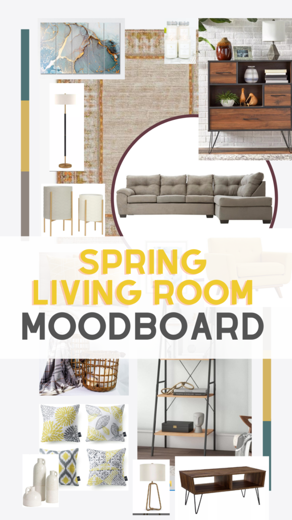
The spring is here and that calls for the best time to refresh your spaces once again! In the season, a host of wonderful Spring House decor ideas have tremendous promise. You should take on new colors, themes, and prints to add a fresh look to your house. This should be your turn to make last season’s home decor. You can upgrade your home decor by using some basic accessories and modern designs. The mood board for the living room is here to help you out. Pantone 2021, a chic way of welcoming the spring in your house, inspired by the colors.
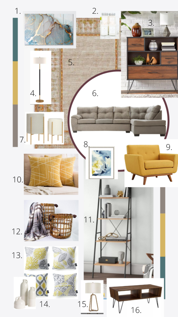
(1) Wall Art (2) Candles (3) Rack Small (4) Floor Lamp (5) Rug (6) Sofa (7) Planters (8) Wall Art Print (9) Single Seat Sofa (10) Cushion (11) Bookcase (12) Basket (13) Cushions set of 4 (14) Decorative Vase set of 3 (15) Table Lamp (16) Coffee Table
The vivid beautiful colors add a cheerful, spring-friendly touch to every interior! The choice of color would also make the room more intimate. Think about the perfect paint scheme with Pantone colors of 2021 the ultimate grey and illuminating mustard shade.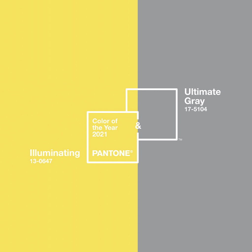
1. 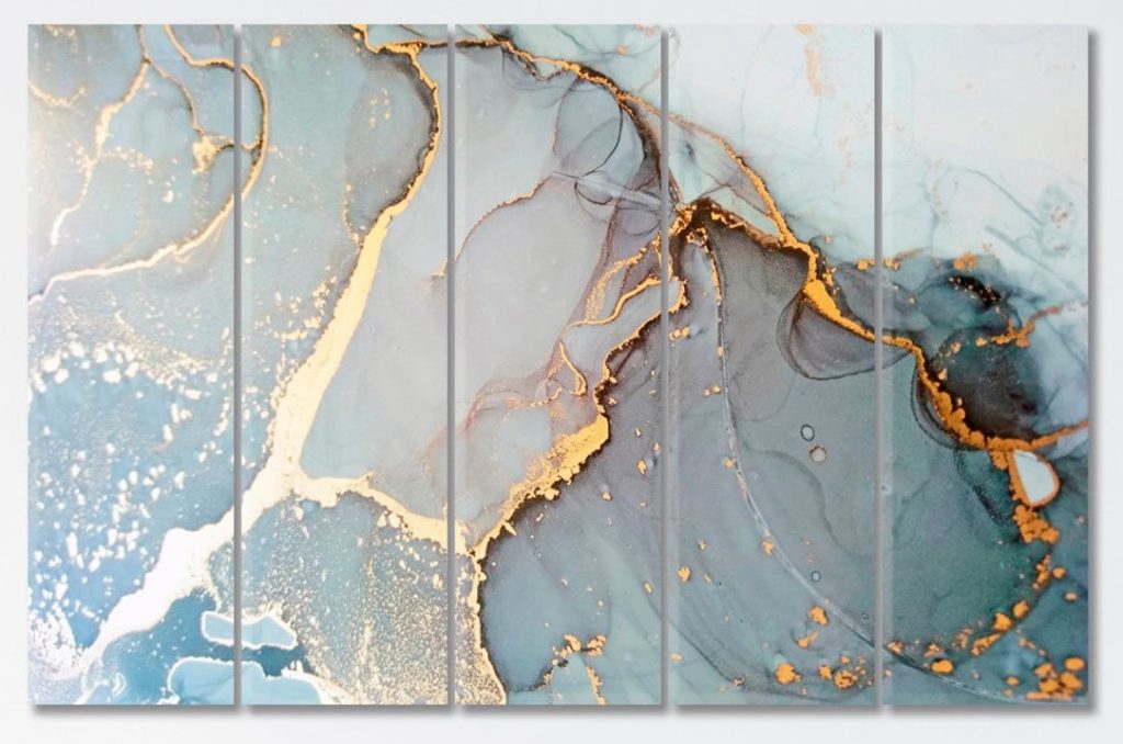
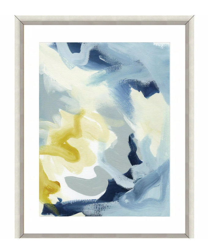
Artworks or decorations inspired by nature are amazingly fashionable today! there is nothing more welcoming spring in your home besides maybe natural features blended into the space architecture.
2.
Pantone’s 2021 has been trendy for the last few years, but this season is visible all around! This color is a perfect choice for Spring, in the form of declaration walls or smaller decorating items. Emerald green or any green, if you don’t like the subdue hues look, is also a big trend and an alternative to Grey.
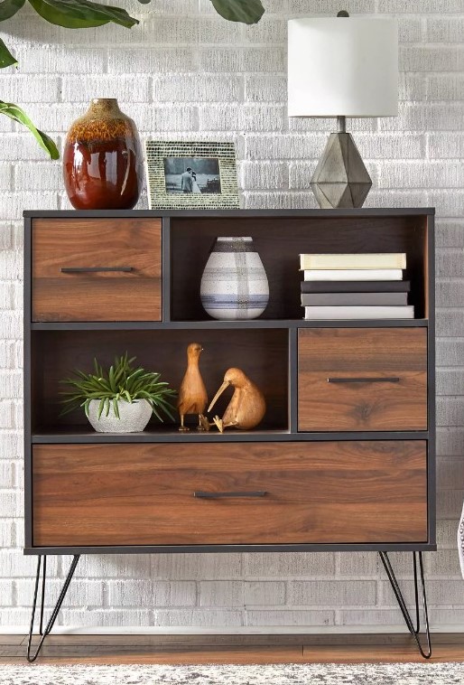
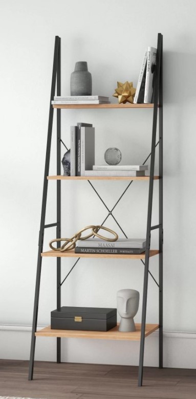
Another item we wanted to add was this beautiful small bookshelf. The fundamental rule for adorning bookshelves is 1-3th books, 1/3 gadgets, and 1/3 empty space. Fill the base shelf with similar books or containers if you are lacking storage. To achieve harmony as well as creativity, arrange 60% of the books sideways and 40% vertically.
3.
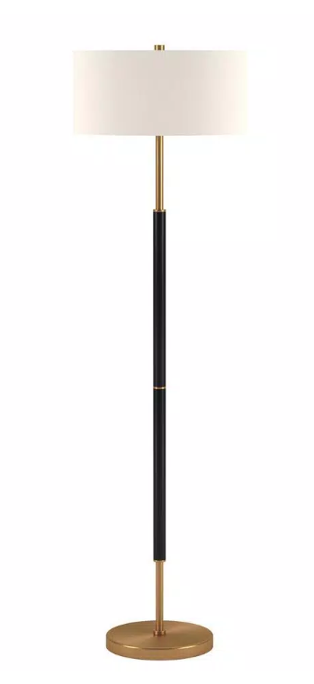
These are advantages of the floor lamp because this choice is perfect and yet so simple that it typically takes almost no room and offers practical job lighting thanks to the stand, while being an essential part of the field. In some kind of traditional and innovative architecture, this type of light can be seen.
4.
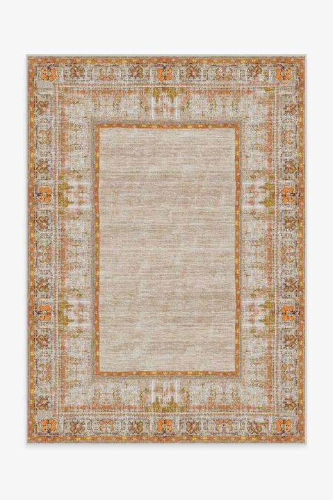
Ruggable’s Rug System comes in two pieces. The lightweight, removable Rug Cover fits perfectly inside the washing machine, while the clingy, nonslip Rug Pad keeps the Cover securely in place. When it’s time for a wash, simply peel off the cover, throw it in the wash, and voilà—good as new!
5.
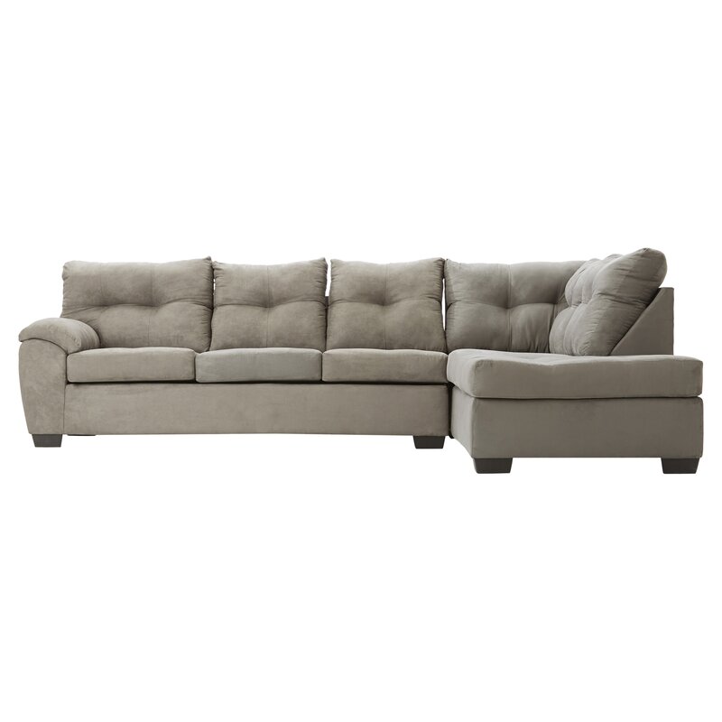
Gray can be completely springy regardless of how you arrange it. And it’s going to be big this year: Pantone has picked Ultimate Gray as the 2021 Color of the Year as a natural hue of the common color. “Colors of gravel on the beach and natural elements that are endured in nature show the potential to withstand time tests, Ultimate Gray subtly ensures that emotions of calmness, stability, and endurance are encouraged,” writes color experts. Add grey like this right-hand-facing sofa set and Pair it for a happy spring flair with vibrant, yellow, or bright Fuschia-colored cushions to add the oomph factor.
6.
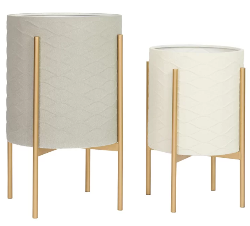
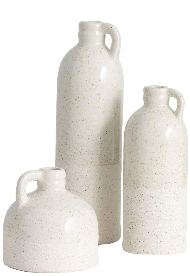
The two safest choices for indoor planters are ceramics and plastics, with both advantages and disadvantages. Ceramic pots ensure that the plants will not suffer overwatering and the root will not rot and even less from overwatering. It implies that you would water more often. Plastic tanks are easy to crack, lighter to clean, and easier. The best one we found was this pair that goes perfectly with the theme.
7.
8.
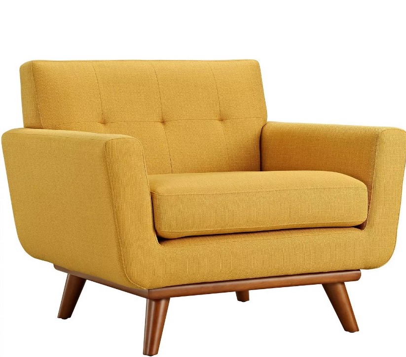
Yellow and orange colors contribute luminosity and warmth to the Pantone palette on the other side of the color wheel. The color named illuminating which means brightness that the company describes as “optimistic yellow that promises a sunny day” and a vivid yellow-orange brightness Marigold are perfect for incorporating colored pops by wall decor, windows, or painted accent furniture. Try to combine the sunny tones with the red-orange Rust, an unusual earthy tone that allows the colors of the Spring to function all year long. Like this seater and cushions in our mood board is a refreshing addition.
9.
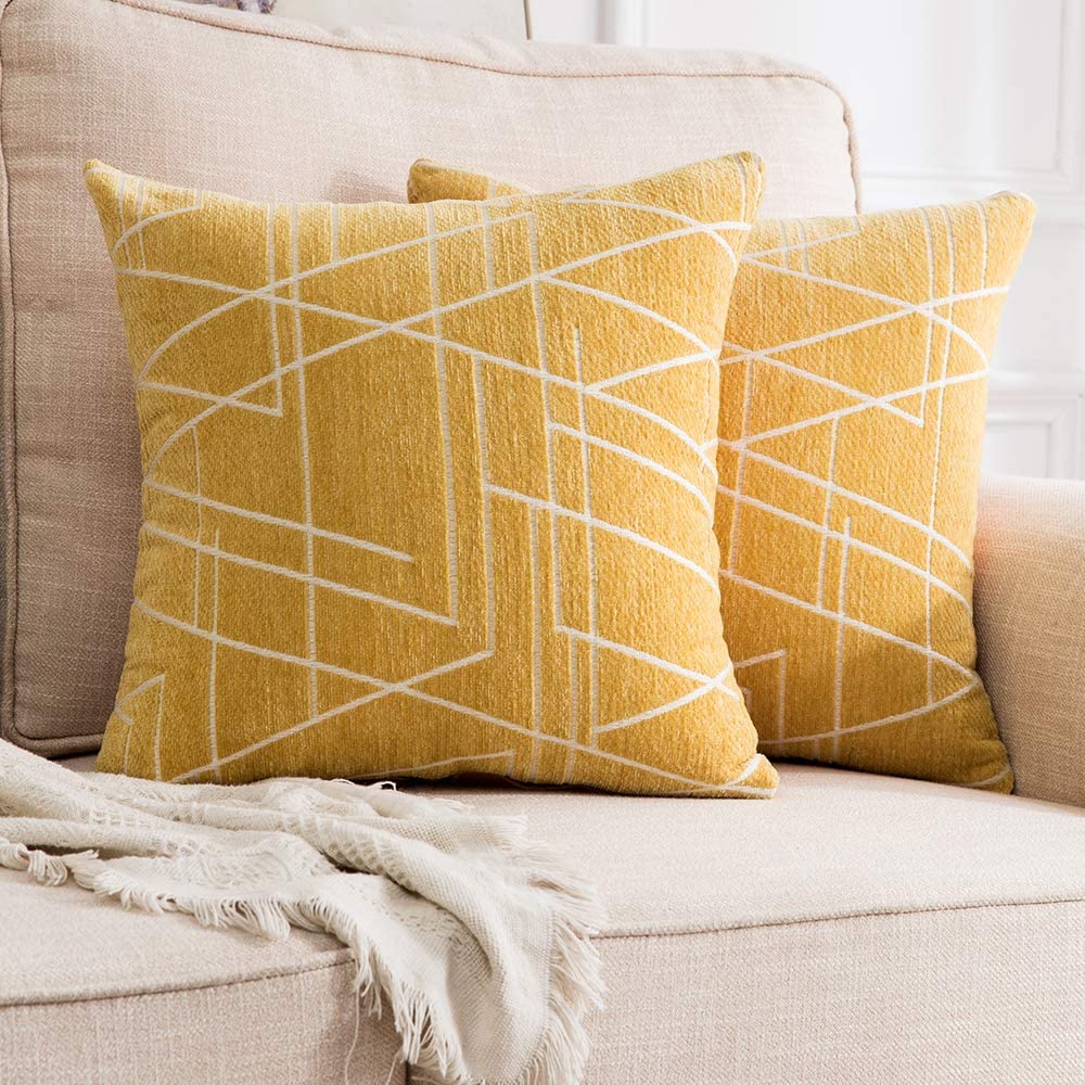
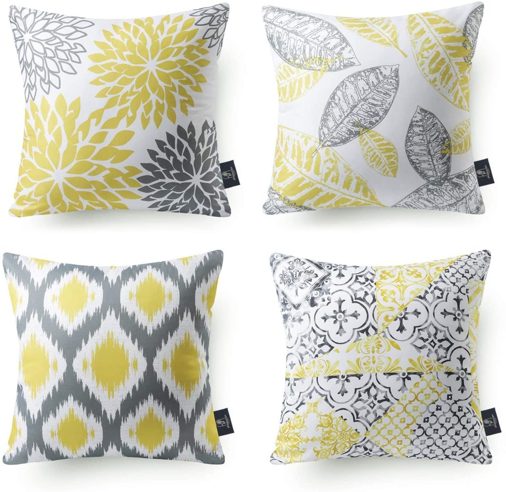
You should always match the cushions with the existing theme. Search for color and texture clothes that match the palette in your home that you already have. Then layer the textures to give an appealing touch. Create the contrasting theme as in this living room where the grey tone sofa has mustard yellow cushions to create the perfect contrast.
The ideal additional storage option for your sheets – towel, throws, and blankets for fancy storage options and decoration accents are baskets. We use them in my living rooms and in bedrooms.
10.

Many people wonder where should we put the bookshelf. Behind the couch, the bookshelves are fantastic. This is particularly true when you live in a relatively small place. Or you have to hide or deal with a space with strange architectural features, such as high sloping ceilings. This little trick is space-saving and often looks trendy.
11.
12.
13.
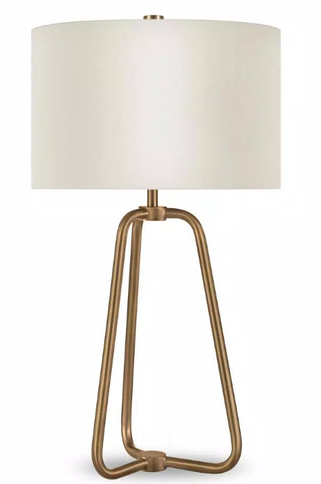
It can be difficult to choose the best one for so many lamp types. so we chose this one to add on side tables. Although – theme is subtly different and can be used for many purposes, the lighting must match the majority of your home decor. It’s the perfect addition to the living room.
14.
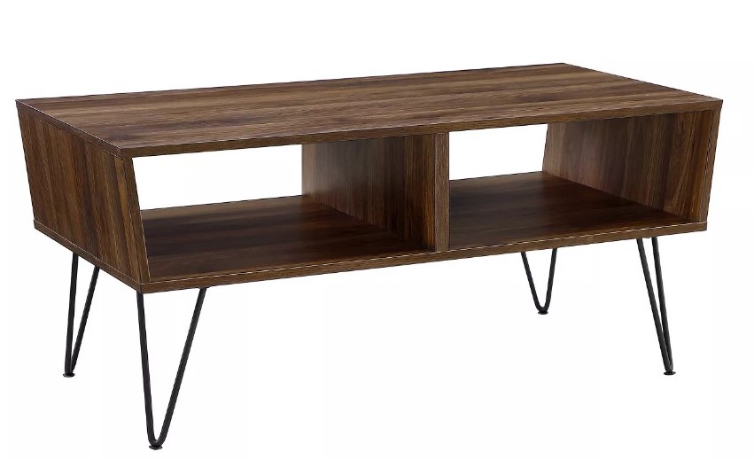
There should be a coffee table equal to the size of the sofa just like this one. The coffee table that you buy needs not be longer than the couch but must be at least half a length of your sofa. A good and medium-happy 3/3 or 2/3 coffee table duration is fine.
16.
I do hope you like the mood board for the living room. If you’re looking for even more tips for styling different areas of your home, the posts from the dupe series can be found on my blog that may be helpful.
Comments will load here